What makes Maxler the brand that it is? We have a great passion for innovation, which is paired with our high standards for quality. We are sure that our products are top of the line and scientifically backed. However, we also believe in a great overall experience. Therefore, our products should be aesthetically pleasing alongside their efficacy.
Maxler is a brand that has always aimed to be recognisable simply by our packaging. We’ve undergone major changes in the design of our products, but we’ve stuck to our principles every time. We believe that packaging should reflect the product and ourselves, so we’ve aimed to ensure that the Maxler logo and style is unique and recognisable while making it easy to understand what the product and its purpose are.
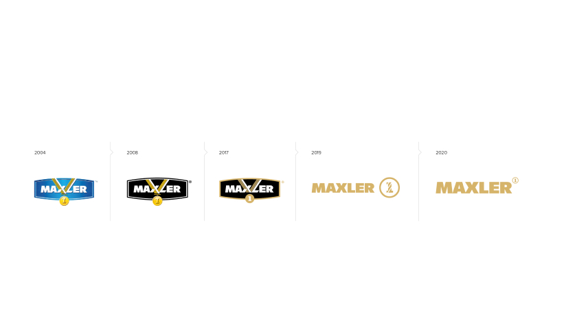
There have been 4 steps in the evolution of our product packaging design
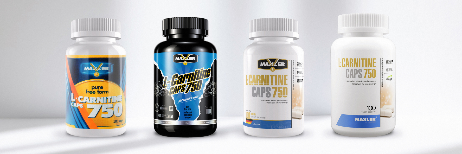
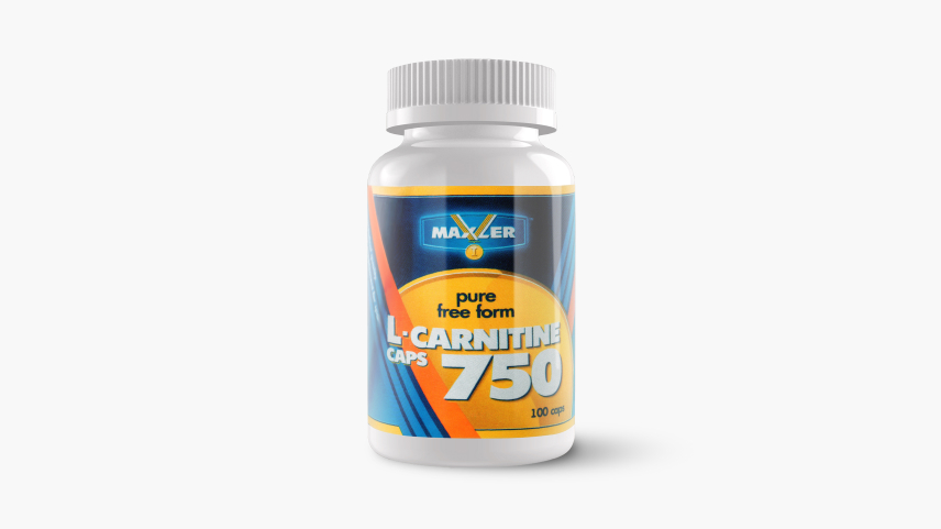
The original design was created in 2004. As a young brand, we came onto the market with a mission to help people become stronger and healthier. Our products were focused mostly on supplements and foods recommended for an active lifestyle, athletes, and bodybuilders.
Our logo used contracting colors and bold design choices. With the design, we welcome you into our club made exclusively for leaders. Maxler is a winner’s choice. Our packaging made it easy to identify the type of product – proteins had a gold medal design, while amino acids had a silver one.
The original design helped us take our place on the sport nutrition market and carved our customer niche.
The second iteration happened in 2008
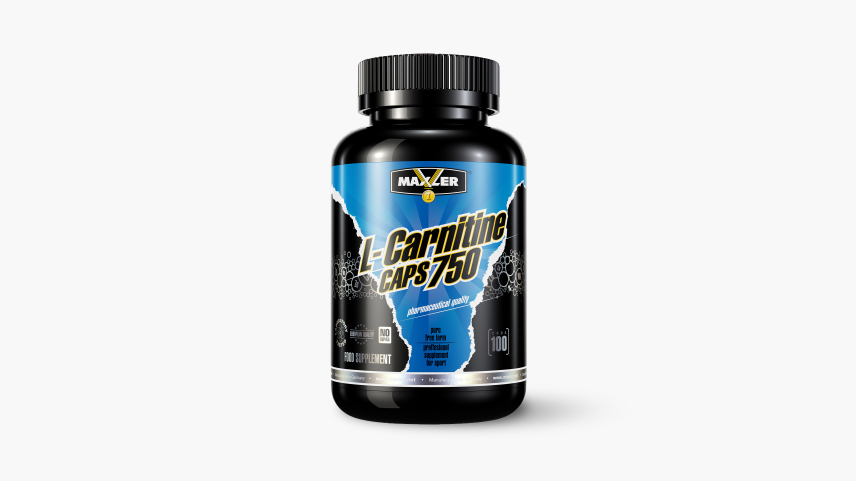
Through the 4 years that we were on the market, we’ve grown as a brand, developing our ethos further. We wanted to showcase our quality, innovative technologies and formulations of each of our products. Our design became more sophisticated and reserved: gold medals took to a black background, product names became more pronounced, loud, bright, and aggressive, as if they were breaking through the packaging.
The different product groups were still differentiated by color, and the black background was perfect for that.
Our new design showed that we’re eager to get ahead, to get first place, to win. We’re here to support our customers’ goals and encourage them to get ahead and reach their own goals. We know that to get ahead, you need courage and to believe In your abilities.
The third iteration took place in 2017
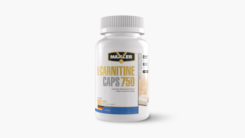
10 years helped us progress further into the market, and we’ve remained recognizable. At this point, we split our products into two lines, called PRO and Wellness.
Our Wellness line helped invite new people into our club. These are fitness enthusiasts, those that do sports as a hobby, or simply those that like to lead an active lifestyle and take care of their health.
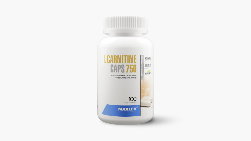
We’ve completely revamped the packaging, with the design becoming reserved while remaining dynamic. Maxler has added a crisp white shirt alongside a working suit to our wardrobe of gym clothes. We’ve decided to not only excel on the court and in the gym, but also at the office and at home. This has led to us adopting a white packaging and easy-to-read labels. The products became differentiated by color at the bottom of the label.
PRO and Wellness lines packaging became connected – the PRO line is black with a seemingly transparent logo, while the Wellness packaging is white with a logo on a black background. This visually creates a connection between the two lines, just like the connection that exists between professional and amateur sport.
Each of the lines keeps getting developed, with new products added, however our labels no longer ‘break stereotypes’, rather they confidently lead the customers towards their goal.
The final step started in 2019
More people are becoming interested in fitness and a healthy lifestyle. Maxler aims to share our experience in making products for professionals and enthusiasts alike to a wider audience. That’s how our Health line came to be.
The Health line mimics the Wellness line in the color of the packaging, however, it positions itself as a separate entity through its fonts and golden ribbon around the label. This shows that no matter your goals, Maxler products will be a great aid in reaching them.
At this point, Maxler has opened doors for each and every one who cares about their health, success, beauty and reaching their goals, whether they are a professional, an athlete, or an amateur.
Our quality is reflected in our new font style, with the letters being straight and elegant, while the label design has no edges to showcase accessibility. We’ve kept flexible and evolved alongside our customers, so each of our designs reflects our history and experience, while changing for the better.
In 2022, it’s clear that the Health line was attracting more and more attention. As the trust in the line grew, we’d taken a decision to update our package design to make the product more relatable to our various customers. We’ve made the fonts less aggressive and more compact and thoughtful. We’ve updated the logo, staying true to our roots while showing off our growth and expansion to new markets through increasing the width of the logo. We’ve gone for a minimalist approach that made our brand easily recognisable and clear, showing our status as a leader on the market.
We’ve changed our designs, but we are keeping true to our ethos and passion for quality.
At Maxler, the health and performance of our customers are our top priority, since you are our №1.